
The Ultimate Guide to Color Contrast Ratios for Better Accessibility

Published by on in category Design and Accessibility

Color wheel highlighting the significance of different color contrast ratios for better readability and accessibility

Why is Color Contrast Crucial for Accessibility?

Welcome to a comprehensive guide on Color Contrast Ratios, an essential topic in design and accessibility. In this article, we'll demystify what these ratios mean and why they're integral for readability and accessibility. We'll cover industry standards like the 4.5:1 ratio, and delve into what higher ratios like 5000:1 imply. Understanding these nuances can significantly impact user experience, especially for those with visual impairments.

What Is Color Contrast Ratio?

Diagram depicting the contrast ratio between foreground and background, illustrating its significance in readability and accessibility

Color Contrast Ratio is a numerical measure that quantifies the difference in luminance between foreground and background colors. It is a cornerstone for making text and imagery easily visible and accessible, including for users with color vision issues.

The Importance of a 4.5:1 Contrast Ratio

Example of a screen demonstrating a 4.5:1 contrast ratio, highlighting its industry acceptance and effectiveness in accessibility

A 4.5:1 contrast ratio is widely accepted as the industry standard, in accordance with Web Content Accessibility Guidelines (WCAG). This ratio ensures text remains legible even for individuals with color vision deficiencies or other visual impairments.

Levels of Color Contrast According to WCAG

Table showing WCAG guidelines on different levels of color contrast, focusing on the AA standard of 4.5:1 ratio

WCAG specifies three grades of color contrast conformance: A, AA, and AAA. The AA level is widely seen as the industry standard, requiring a 4.5:1 contrast ratio between foreground and background.

What Does a High Contrast Ratio Mean?

Display showing the difference in image quality with high contrast ratios, emphasizing deeper blacks and brighter whites

Higher contrast ratios like 5000:1 or 100000:1 indicate a display's ability to produce significantly brighter whites compared to darker blacks. This results in deeper blacks and an enhanced overall picture quality.

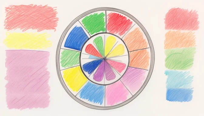
The Strongest Color Contrast

Example showcasing the strong contrast between black and white, and its effectiveness in readability

The most potent contrasts are typically between black and white, often called light-dark contrast. Such high contrasts are not only effective for readability but can also be achieved using vibrant colors adjacent to darker ones.

How Good Is Good Enough?

Range of displays illustrating contrast ratios from 1000:1 to 3000:1, highlighting their sufficiency for general use

For common tasks, contrast ratios from 1000:1 to 3000:1 are usually sufficient. Yet, advanced OLED displays with ratios up to 100000:1 provide even better quality, ideal for specialized applications like professional video editing.

Recap: The Significance of Color Contrast Ratios

In conclusion, understanding Color Contrast Ratios is indispensable for anyone involved in design and accessibility. Whether it's meeting the WCAG standard of 4.5:1 or understanding the implications of higher ratios like 5000:1, these metrics are pivotal for creating a universally accessible user experience. Both readability and accessibility benefit immensely from the right color contrasts, making it not just a design choice but an ethical and possibly legal requirement.

Mastering Front-End Optimization: The Ultimate Guide to Web Development and Performance The Comprehensive Guide to Accessibility Compliance: WCAG and ADA Explained