 E-Commerceo
Viewport vs. Screen Size: What's the Difference?
Screen size refers to the number of physical pixels on a display, whereas viewport is the area of software pixels that a user can see on their screen. Essentially, viewport size represents what's actually visible, while screen size accounts for the device's total pixel count.
What is the Concept of Viewport?
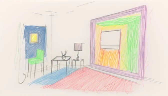
A viewport is the region of the display that shows a part of the total content to be presented. In virtual environments like desktops, the viewport allows you to see a specific section of a larger 2D area.
Understanding Viewport in Coding
In coding, the viewport is the visible area of a web page on a device. This area varies depending on the device being used, and it's especially crucial for responsive web design to consider varying viewport sizes.
Types of Viewports

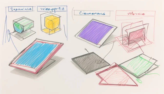
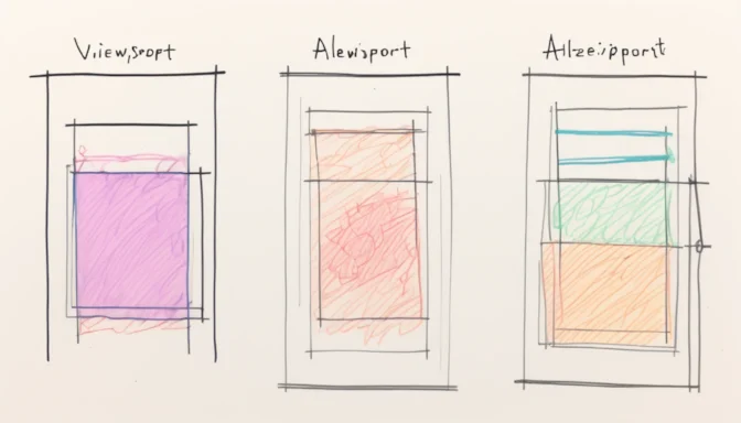
Viewports can be categorized into two main types: the layout viewport and the visual viewport. The layout viewport encompasses all elements on a web page, whereas the visual viewport represents the part of the page currently visible on the screen.
Why Use Viewports?
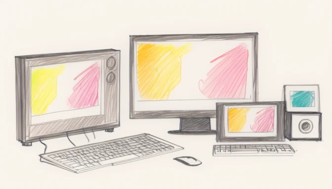
Viewports are essential for displaying web content effectively across diverse devices. They enable designers and developers to create websites that are accessible and user-friendly, irrespective of the device being used.
Viewport and Visual Viewport: Distinguishing the Two

The layout and visual viewports serve different functions on mobile web. While the layout viewport holds all the page elements, the visual viewport adjusts based on user interactions like pinch-zooming, offering a more dynamic view of the page.
Viewport Best Practices

For optimized usability, avoid setting specific width values. Instead, use relative width values like em, rem, and percentages. This ensures that your web content adjusts seamlessly to various device sizes.
Viewport in UX Design
In the realm of User Experience (UX), the viewport plays a pivotal role. Its size varies with the screen size of the device, making it essential for designers to consider this when creating user interfaces.
Browser vs. Viewport

The browser window and the viewport are not the same. While the browser window can be resized, the viewport on a device screen remains fixed, especially in fullscreen mode. Understanding this difference is crucial for effective web design.