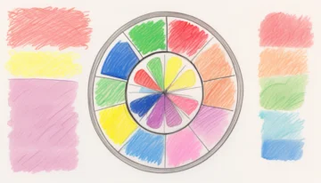
Unlocking the Secrets of Color Contrast Ratios: A Guide to Better Visibility and Accessibility

The Ultimate Guide to Color Contrast Ratios for Better Accessibility
Dive into the world of color contrast ratios and discover why they are crucial for both readability and accessibility. Learn how to meet and interpret industry standards like 4.5:1 and 5000:1 as defined by WCAG.
 E-Commerceo